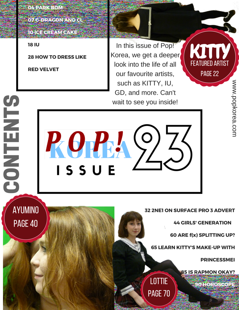
I followed a similar style to the rest of my magazine when making my contents page by keeping a plain white background but filling most of the space with images and coverlines. The centre of the page catches the attention of the reader first, informing them what magazine they are reading and what issue it is- I chose it to be issue 23 as that indicates it is a continued magazine that is quite popular as they can keep making more issues. I followed the 'bubble' theme of having dark red/pink shapes to point out the artists' names and what pages they are featured on- this stands out against the rest of the page meaning readers can go straight to those pages. I edited my photos to get rid of backgrounds, change orientations (Kitty), and layer images to give them interesting styles and the suggestion that they are an album cover (Ayumino). Coverlines are separated so as not to clutter the page and I featured a short Editor's Note in the upper left to give the page a personal touch,
No comments:
Post a Comment